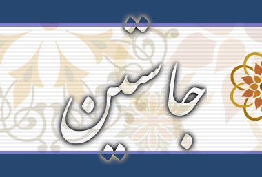
That's "Justin" (or some odd-sounding accented version of it) written in Persian script. Persian for the most part uses the same alphabet as Arabic, but it adds a couple of letters and changes a couple pronunciations.
I don't know if I've ever mentioned it on the blog, but I've mentioned it in IMs and forums: I think Arabic script is the prettiest writing system I've seen; Tengwar takes second (even though it's not a real-world script). Din dabireh and Devanāgarī get honorable mentions.
And I know I've mentioned it to a few different people on IM, but I'm not sure if I've mentioned it on the blog, but I've experimented with making a few scripts myself, some experimental (just to try out a theme), others are intended to actually be used.

These are called S-Runes. I was originally going for something like Chinese characters, but based on mathematical formula. This was an experimental character set. Originally they were written at about a 30 degree slant, but that didn't work at all with a computer monitor, so I made them straight horizontal and vertical.

Some early sketches of the S-Runes, back when they were still slanted:

Next is another experimental script. This one was based on simple multiplicative complexity: using combinations of 1/3 top and 2/3 bottom glyphs to form each character, occasionally forming things that don't look exactly like the combination would lead you to expect.
There was a third experimental script based on a tic-tac-toe board (no, you're probably not correctly imagining what it looks like), but I'm not sure where the paper I had that written down on is.

Next is a real script, called something along the lines of Caia hieroglyphics. This was originally to be the official Caia writing system, but I ultimately decided it was too cumbersome to use for a language that is designed for efficiency. It kind of resembles Aramaic script.

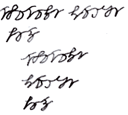
Lastly, the current official Caia script. This is fairly heavily derived from the Caia hieroglyphics, as it was supposed to be kind of like cursive is to printing. Many of the Caia hieroglyphs can be found in some form in Caia script, but a number of them couldn't be adapted well to script form.


7 comments:
Neato.
As I'm sure you've seen, I don't have remotely nice enough handwriting to contemplate script building (unless they're perl or ruby scripts).
Are there any real-world scripts with this kind of mathematical influence?
The only problem with script #1 (moreso than the others) is that it lacks (forgive the overloaded term) character. More akin to a barcode than a human communication system. I think scripts should fit the writers, and real humans aren't mathematical creatures.
That's why I love the look of Asian and middle-eastern scripts, and obviously European/Latin scripts too. I have a grandmother who learned to write overseas; her writing in particular is really interesting and aesthetically appealing to me, even at 82 years old.
--dispensa
Hi!! I'm happy you liked it! :)
By the way, I didn't understand. you mean one of the letters in your art is Persian that doesn't exist in arabic alphabet? Well, there are only four letters that Persians have and Arabs don't. They are P (پ), Ch(چ), Zh(ژ), and G(گ) and your name doesn't contain any of these.
I really like the S-Runes. They look logical and are fairly recognizeable which is the visual trademark of any language.
By the way, I didn't understand. you mean one of the letters in your art is Persian that doesn't exist in arabic alphabet? Well, there are only four letters that Persians have and Arabs don't. They are P (پ), Ch(چ), Zh(ژ), and G(گ) and your name doesn't contain any of these.
Ahh, my bad. I mistook the character for J for the one for CH. Can you native speakers really see the difference in 12 pt font (what Wikipedia used, which was what I was reading)? I had to blow them up to at least 16 to see a difference :P
I really like the S-Runes. They look logical and are fairly recognizeable which is the visual trademark of any language.
And the neat thing about those is that because of the design, there are a couple hundred thousand possible runes (although readability might require lowering that by one or two orders of magnitude) and each one has a maximum of 6 strokes. That's a heck of a lot better than Chinese, although it isn't idiograph-based.
Actually, the original idea was to make small, simple idiographs using that pattern, then combine them two-dimensionally, as Chinese does; but I never actually got around to that.
lol yes dear, I give you every right! Dots are tricky even for some natives :D
Are there any real-world scripts with this kind of mathematical influence?
No idea. Go fish :P
Post a Comment